The field of dentistry is haunted by an all-too familiar image:
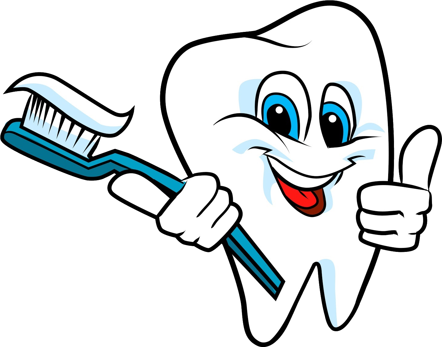
Since the 1990s we've been forced to grapple with the existence of this monster. Every six months we walk into our dentists' offices, sign in for our appointment, and then it hits us – whether on a fridge magnet, pen, a piece of stationary... we have no choice but to face him: the tooth holding a toothbrush. Have mercy on us all.
You might protest: it can't be! The tooth himself has teeth! Are each of these teeth also cursed with eyes that see, hands that feel, and another mouth full of identical abominations? Are we dealing with some sort of unholy hygienic fractal??
Despite this, some variation of the above image has been used in dental practices for decades. Many people have sought refuge in tasteful serif fonts in aqua and/or dark blue. Anything to do away with the tooth brushing its own teeth!
What else can we do?
When I talked to West Point Dental, their biggest goal was to develop a brand identity that was modern and professional. We discussed some of their goals and preferred color palettes to try to get a sense of the overall "vibe" of the practice. They were hoping to showcase the relaxed, approachable, and understanding side of their practice that they had nurtured. So, we agreed to try something that was round and fun while still being professional.
This lead to an initial logo design:
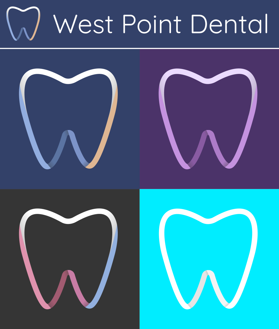
While the client had asked for something blue, I included these alternate palettes to see if anything else stood out to them. The design uses gentle curves and soft gradients, with a stylized "W" at the bottom of the tooth.
Can you make it yellow?
I got a lot of great feedback on this design, but the client asked me an important question:
Can you make it yellow?
I thought this was a great idea! While we liked the design, we realized that it was still just a little too safe. The blue color palette caused it to blend in with other dental practices, and in a field with very strong competition, we needed to stand out.
With a little more discussion, we arrived at this design:

The tooth graphic is the same, but we've done away with the gradients. Instead we have a yellow and charcoal design in a round badge, with a white outline offset to add a little fun.
The use of yellow is touchy. Too dark and it looks mustardy and dirty... too light and we aren't achieving the proper contrast. We went through several tweaks to the yellow used here!
Using this logo as the base, I created a style guide. Here are some of the highlights:


The client was very excited to have a brand that was unique and colorful, one that stood out from other dental practices in the area. They were able to take this style guide and apply it to their social media:
The client designed this post on their own! And I think it looks great. 😀
I followed this up with some business card designs:
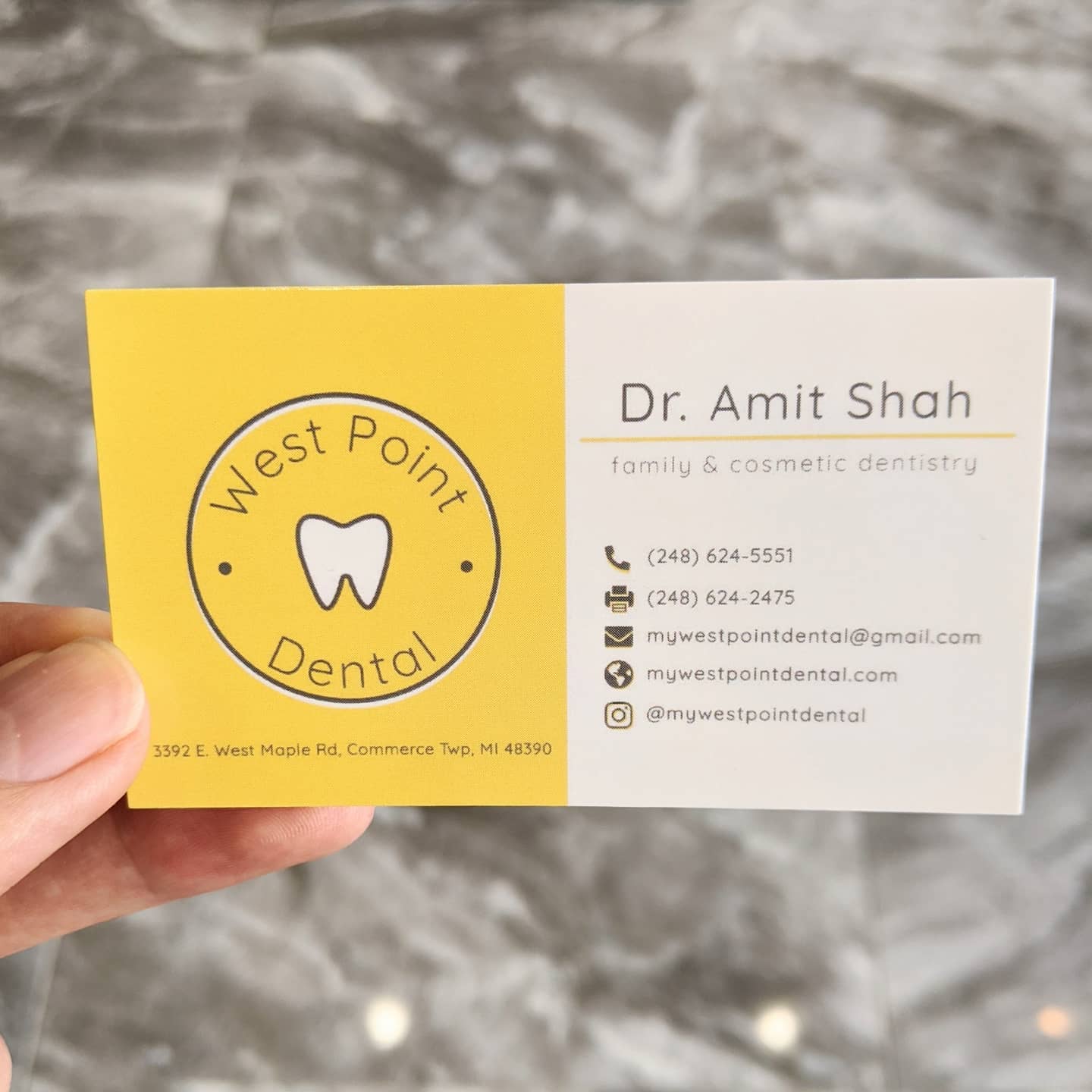
The client was really happy with these! They had this to say:
Everybody I sent these to loved them! I'm happy to see them sitting on my desk every day. I have gotten so many compliments since I started giving them out!
Lessons learned
Leaving design cliches is challenging but exciting - we tend to gravitate towards cliches, like the dreaded tooth brushing its own teeth, or the dark blue and aqua serif fonts of many dentist practices. It's sometimes difficult, but leaving these behind is a very effective way to create a distinctive brand in competitive fields.
Be open to change - the client and I liked the initial design, but realized it could be taken further. It's always a good idea to take a pause and ask if other approaches might be worth exploring.
Style guides can be a valuable asset to small businesses - I was thrilled to see that the client was able to take my style guide and apply it to their social media to create some great content on their own. This is an awesome option for small business who may not have a social media/brand specialist.
This was a really fun project and I learned a great deal! The most important was probably the first – be willing to leave your comfort zone. Yellow is rarely used in dental hygiene, and obviously, if done wrong, can give a sickly or dirty effect. It was a risky choice that paid off, but I would not have gone there without really listening to the client and trying their suggestions. ✨
