I've been going to Espresso Milano since I was a teenager. In high school it was always the place to meet up and chat, and in fact, I went there long before I even liked coffee... 😮
So I was very excited when I got the opportunity to design and build the new Espresso Milano website! Like most of my projects, it started with a little weekend jam. I usually start with the "vibe" of the space I'm trying to reflect. Espresso Milano has always been fun and quirky (you'll notice a new hidden doodle or two every time you visit!), and I wanted to make sure to bring this to the forefront.
This project was a bit like the West Point Dental design in that it had to break from tradition. Almost all coffee shop websites go with a minimal design that utilizes a great deal of white space. The majority of these sites are built with a site builder – they're clean, but they don't exhibit much character.
Before diving into this project, the client and I agreed – that look just didn't mesh with Espresso Milano! We wanted a design that was charming, maybe a little cartoonish.
Technical highlights
- The new site achieves very high scores for performance, best practices, accessibility, and SEO through Google's Lighthouse tool
- The site is fully responsive with views optimized for all device sizes
- The new site contains several stylish animations and transitions, such as the animated logo and hover effects, all done with hardware-accelerated CSS (no JavaScript)
- I created an interactive menu for the desktop site which uses modern 3D rendering in the browser (boosted by your GPU!)
- I added a depth or "parallax" effect using pure CSS – again, no JavaScript!
- No bloated external libraries were used – all code was written by me
- I used Intersection Observers to achieve some slick scroll transitions
The design process
When designing, I like to find a single focus point, a sort of totem that will guide the rest of the process. One thing that came to mind was the Espresso Milano coffee cup:
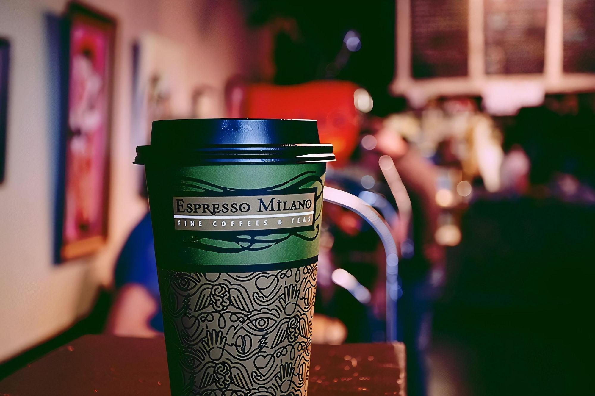
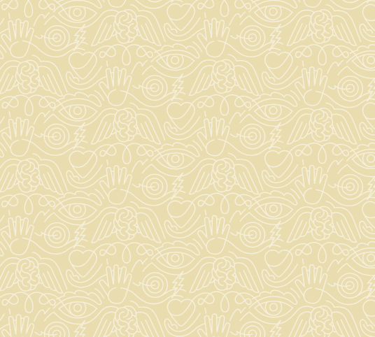
I really dug that doodle on the bottom half of the cup. To me, it was the perfect representation of the vibe I got from the store. I got a copy of the original image and worked from there:
But now for the logo. I had always admired the scotch.io logo for its graceful, unintrusive use of motion. This demo also helped me to understand the effect and pull it apart. The idea was to show the logo "filling up" with coffee when the user arrived:
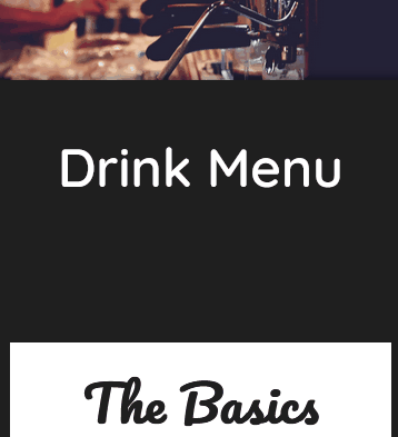
The other major attraction of this site is the fully 3D menu. The client had mentioned that they wanted their menu on the site, and tossed around the idea of presenting it in a fun way. In the past, you'd sometimes see hefty third party applications or libraries that used things like Flash to create snappy (but slow and inaccessible!) menus.
These days, it can all be done in the browser! 🤩

This was REALLY fun to develop! I followed this beautiful example but tweaked it quite a bit. The example uses pure CSS, which is amazing, but I felt it was actually more intuitive to use JavaScript for parts of this. Of course, the animations are all still pure CSS to keep them silky smooth, but I used a little code to determine which page to display when the user clicks and to add a keyboard handler so that users can press the right and left arrow keys to navigate.
On mobile, this book separates into page blocks. The client had mentioned that they thought it was cool when images slid onto the page upon scrolling to them, so I added that. They liked the effect!
And, for a little extra bit of fun, I added a spooky Halloween theme that automatically activates every year on the week of Halloween:

To me, this sort of thing is totally in line with the Espresso Milano style – it's offbeat and unexpected. And hmm... what happens when you click the pumpkin there? You'll just have to wait until next Halloween to see... 🧛♀️
Lessons learned
- Pure CSS 3D is not scary! It can add some delightful effects with very little overhead.
- That being said, parallax is touchy. Safari in particular does not seem to appreciate some of the 3D transforms I used, meaning I had to disable them on iOS devices. These effects are powerful but their implementations are still being hashed out.
- SEO is largely driven by best practices and accessibility. In the past, developers would try to game the system to drive their search results up. Today, Google favors high quality web experiences. I was happy to see that I was given a 100 SEO score before even optimizing for SEO on the basis of best practices and accessibility alone.
How did I do?
I used Google Lighthouse to measure the performance of the site:
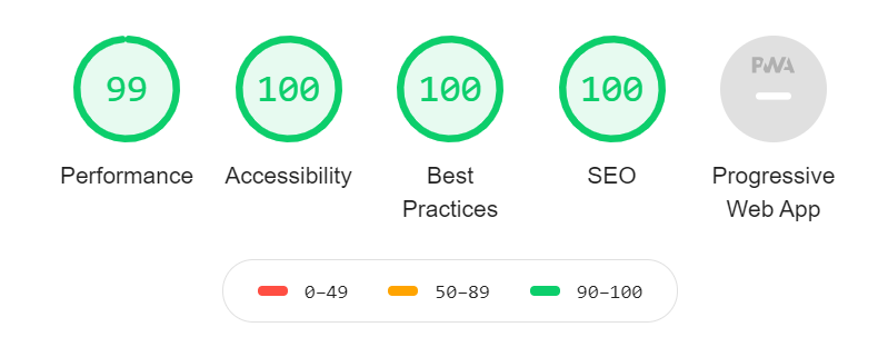
Nice! 🤘
